
Now that you know how email marketing can help your business, it’s time to start building your email list.
In this chapter, we’ll show you how to choose the right email marketing provider for your needs, tips on how to capture people’s email addresses, and the different types of lead magnets people would actually want to sign up for!
#1 – Choose your email marketing provider
You’ll find plenty of email marketing providers on the web, with each offering various features at different price points. If you’re just starting out, then you may not require all the extra features included in top-tier plans.
At the very least, however, choose a provider that offers the following:
- User-friendly interface – a WYSIWYG or what-you-see-is-what-you-get editor would be ideal. Running an email marketing campaign for an ecommerce business isn’t easy. You should spend most of your time working on your business, not designing and coding emails!
- User segmentation – this is a must-have feature for anyone doing email marketing, so you can send the right emails to the right group of people.
- Automated email sequences – these are a series of messages that are automatically sent out after an event or trigger is met.
- Campaigns – send one-time emails to various user segments or your entire list if necessary.
Also, a nice-to-have feature offered by some providers is free opt-in forms and landing pages. This is where your leads will enter their name and email addresses when they sign up for your list.
These providers also have a library of templates you can choose from, so you don’t need to worry about designing them, too.
Most providers also offer a free trial, so you can check out which one has all the features you need.
Find out which one you like best before paying for a subscription.
#2 – Create your lead magnet
Your lead magnet is your bait to get people to sign up to your email list.
After all, no one will willingly give you their email address, unless they get something in return.
In this case, what they get in return is your irresistible, value-laden ‘bribe’ called lead magnet.
Here are examples of lead magnets:
2.1. eBooks
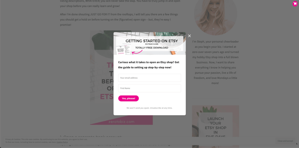
eBooks are relatively easy to put together and can solve problems in a downloadable, easy-to-read format (usually PDF). For example, you can expand upon an existing blog post or combine related articles into one eBook.
The sample eBook lead magnet from ZerotoBiz is only 6 pages but packs a ton of value for anyone interested in opening their own Etsy shop:
2.2. Whitepapers
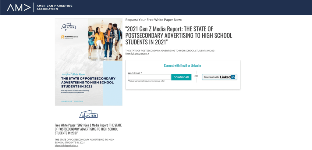
Whitepapers help your readers understand and solve certain problems. It positions you as an expert in your niche as well, especially since it’s backed by in-depth research and credible sources.
Whitepapers need not be lengthy, but they are professional in tone and can take several weeks to complete.
Check out this free whitepaper from Academica Group and Glacier which surveyed more than 1,400 students:
2.3. Case studies
These are real-life examples of how your products actually helped your customers. It gives your prospects a glimpse of what would happen if they sign up/purchase your products.
Make sure you include testimonials and statistical evidence to prove the tangible benefits of using your product.
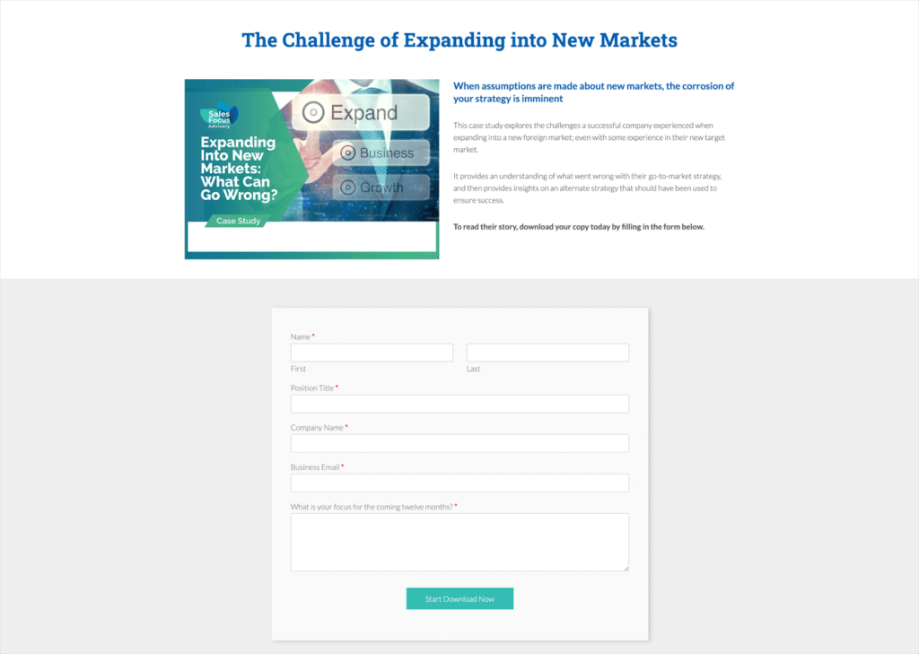
Here’s an example of a case study from Sales Focus Advisory that talks about the challenges of expanding into new markets.
Note how they require more than just a name and email address before their leads can download the case study. This is useful for user segmentation:
2.4. Templates
These time-saving tools can help your leads save a lot of time. Instead of doing something from scratch, they can use your free template to copy and paste, or fill in the blanks.
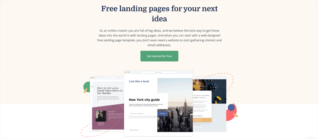
Take a look at Convert Kit’s free landing page templates. If you’d like to use them, all you have to do is click on the “Get started for free” button.
2.5. Trial subscription
Let your prospects take your product out for a spin, so they can personally see if it’s the right fit for them.
It’s a win-win for both you and the customer as it removes any risk on their behalf, thus reducing the chances of refund requests.
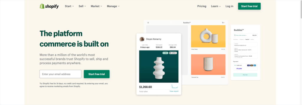
Here’s an example from Shopify which gives potential customers a generous 14-day trial with no credit card required:
2.6. Discount code
If a trial subscription is not applicable for your ecommerce business, try using a discount code instead.
Anyone who signs up to your email list gets a sweet discount on their favorite products!
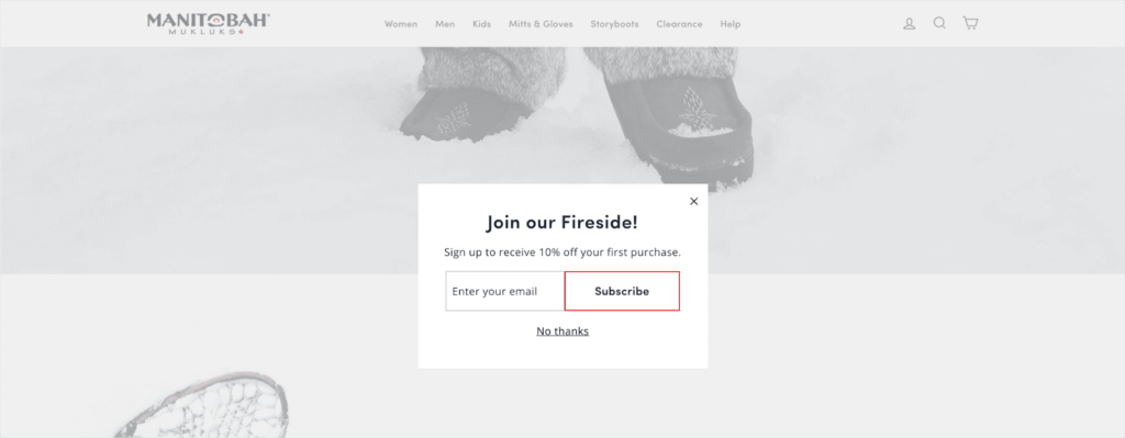
Check out Manitobah Mukluks 10% discount offer to new subscribers:
2.7. Webinars
These are live or pre-recorded events that offer a ton of value to subscribers.
Webinars are typically informational and conclude by giving the viewer a special discount to make a purchase.
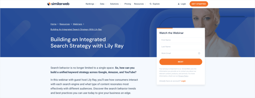
Here’s an example of a webinar lead magnet from Similar Web:
As you can see in the above examples, lead magnets all solve real problems and have a perceived value in the eyes of prospects.
Emphasize the value they’ll get from your lead magnet – and what kind of emails to expect once they’re on your list.
Don’t make them jump through hoops – give them that quick win after they give you their email address.
If you don’t deliver as promised, don’t be surprised if they unsubscribe just as quickly as they signed up!
#3 – Build your opt-in form or squeeze page
You’ll need to build an opt-in form or squeeze page to extract a potential lead’s contact details, e.g. name and email address.
Now, designing a squeeze page is the first step to getting your lead magnet noticed.
You can offer the most valuable and insightful piece of content, but if people are ignoring your call to action, then it’s not going to see much action, a.k.a. sign-ups.
Here are the key components of a high-converting squeeze page:
3.1. Eye-catching design
Your form should catch people’s attention.
You can do this by using colors that contrast with your main website colors.
Use a color scheme design tool like Paletton or Adobe Color to figure out the best colors for your opt-in forms.
3.2. Headline
What’s the biggest benefit for people who sign up?
Or what’s the biggest pain point your lead magnet solves?
Use it to get people to sign up to your list.
3.3. Offer
This is where you make your pitch. What are they going to get exactly when they sign up?
Remember to use the kind of language your customer avatar speaks/uses (more about avatars in Chapter 6).
That means if you’re talking to a younger crowd, use words and terminology they would commonly use.
3.4. Limit the number of form fields
You literally only need an email address (but a first name would be nice too so you can address them in your email).
There’s no need to ask for their phone number, location, favorite food, number of pets, etc. unless it makes sense for your business.
The more fields they need to fill up, the less likely they’d want to sign up, no matter how compelling your offer is!
3.5. Call to action
Don’t leave your prospects hanging. Instead, tell them what they need to do next.
For example, if you’re using an eBook as a lead magnet, your CTA can be “download eBook here.”
Or if you have a discount code, you can say “click here to get your 20% discount.”
Make your CTA as irresistible as possible!
3.6. Social proof
It’s always easier to convince people when they see testimonials or reviews on a squeeze page.
Pick the best testimonial from a happy customer and paste it up on your squeeze page!
3.7. Keep it simple
Remember the purpose of a squeeze page is to ‘squeeze’ people to give you their email address.
The more unnecessary elements there are on your page, the more likely it is they’ll get distracted and eventually forget to sign up to your list!
#4 – Where to put your opt-in forms?
To optimize your success rate, use multiple opt-in forms to make your lead magnet visible throughout your entire site. Here are some ideas:
4.1. Squeeze page
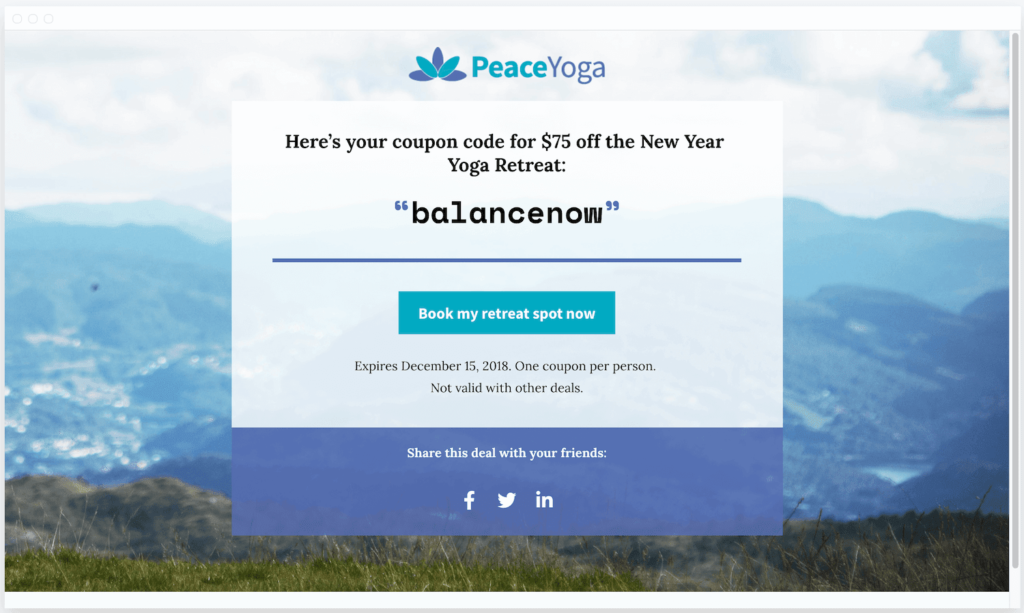
A squeeze page is a type of landing page that’s designed to either ask for a lead’s email address or the sale.
Squeeze pages don’t have the header and footer found on every other page on your website and are therefore less cluttered and distracting for visitors.
Here’s one of the templates from LeadPages:
4.2. Pop-ups and sliders
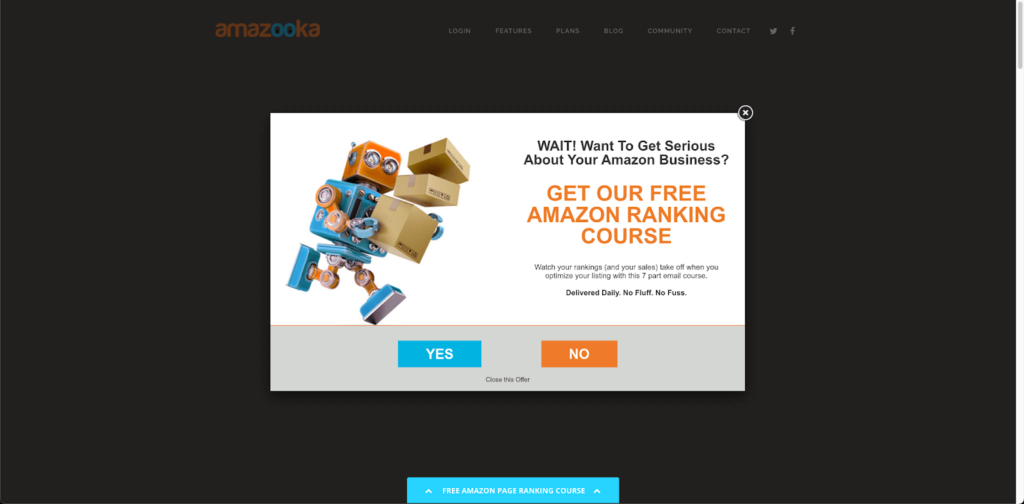
These pop up or slide over on top of your web page, usually at key times you specify beforehand.
For example, you can set these to appear after a user has been on the site for 10 seconds, or if they scroll down halfway the page, or if they hit the Exit button.
Most email marketing providers allow you to create and design your pop-ups.
You can run a survey, a webinar registration form, a quiz, a lead magnet download, and more.
Here’s an example pop-up from Amazooka:
4.3. Header
Sitting at the very top of your website, the header is one of the first things people see when they land on your site.
The header may include a combination of your store logo, your menu/navigation, search bar, and headline.
If you can squeeze in an opt-in form like the example below, do consider adding it to your website.

4.4. Footer
When your visitor scrolls down to the bottom of the page, they’ll see your footer.
But who would scroll down that far?
Those who would like to know more about your ecommerce business and potentially sign up to your list – that’s who!

4.5. Sidebar
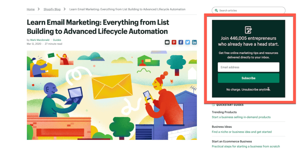
People browsing your site on a desktop will see your sidebar and opt-in form.
If the CTA on your sidebar opt-in form is relevant to the content they’re browsing or reading, they’d be more likely to convert.
Here’s an example:
4.6. Blog posts
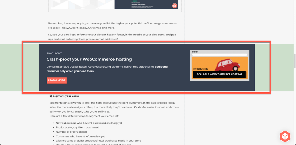
You can add your opt-in forms to the top, middle, or bottom of your blog posts.
Here’s an example from Convesio’s blog on email marketing tips for WooCommerce:
Important tip: Make sure your opt-in form actually works. Sign up yourself and check if you’re added to your mailing list!